Pantone named it. Miranda weaponized it. We’ve been living inside it for 20 years.
The cerulean scene lands like a slap.
In The Devil Wears Prada, Miranda Priestly delivers a lesson in power—who gets to decide what good taste looks like and who doesn’t.
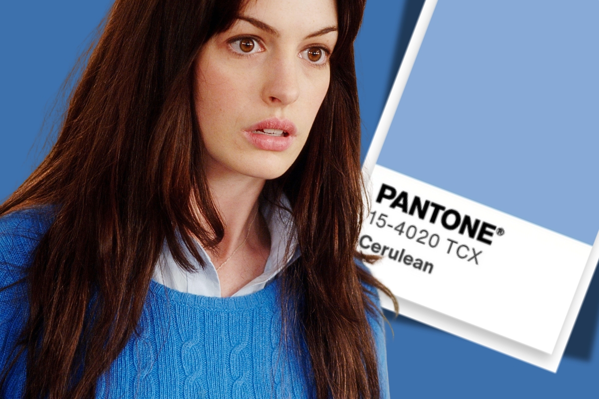
Andy Sachs, earnest and oblivious, smirks during a fashion run-through because the stakes are invisible to her. She’s wearing a shapeless, pilled blue sweater and believes that it’s her freedom from fashion’s grip. Miranda dismantles that fantasy in about 30 seconds. “That lumpy blue sweater,” she purrs, is not rebellion; it’s the last stop on a very expensive conveyor belt of taste. Designers chose cerulean, magazines anointed it, department stores bought it, and eventually it washed up in the discount bin where Andy mindlessly plucked it out of the pile.
Cut to 2026, and cerulean is back because of course it is. Meryl Streep strides onto The Late Show set with Stephen Colbert in a look-alike cerulean sweater, fully aware that every still shot will be stitched side by side with screenshots of the original scene. The same week, Anne Hathaway is photographed in a sweatshirt with a Pantone-style cerulean block printed across the back, as if to say: Yes, we know exactly what we did to you with this color—and we’re doing it again. There’s a sequel on the way, and instead of pretending this was just a throwaway line, the women who embodied that moment are leaning all the way into it. Cerulean has become both joke and prophecy.
The joke works because cerulean is weirdly specific. It’s not “blue” in the lazy Crayola sense. It’s a sky-leaning blue with a whisper of green in it—somewhere between a bright summer sky and shallow, sunlit water. When you see it, your body recognizes something: openness, breath, possibility.
Then Pantone commercialized that feeling. In 2000, it anointed cerulean as its first-ever Color of the Year—the official hue of the new millennium. The idea that a committee names a color, designers consecrate it, magazines amplify it, and you end up buying it six months later in some fluorescent mall isn’t a fantasy; it’s how Pantone’s power works. Cerulean was framed as calm, trust, stability—a soothing sky over a turbulent world at the start of the new millennium. From there, the machine kicked in, pushing cerulean-adjacent tones into everything from kitchen appliances to yoga mats.
So when Miranda delivers her monologue about “this … stuff,” she’s not just being cruel. She’s reciting a real theology of color capitalism. Cerulean was literally held up as the hue that could soothe the global psyche. Of course it wound up as a sweater in a bargain bin.
The question is: Was Miranda right about what that means?
Her thesis is on point and brutal: You’re not special; you don’t get to sit outside the system. Your “I don’t care about fashion” posture is just another expression of the same machine that churned out the things you believe you chose independently. There’s truth there. Pantone’s Color of the Year announcements do move markets. When the named shade takes over, it’s not an accident.
But there’s also something missing in Miranda’s lecture: us, now.
Women over 50 are not Andy Sachs. We’ve lived through avocado refrigerators, Tuscan beige everything, dusty rose, teal, jewel tones, gray-on-gray minimalism, greige, and five waves of “white kitchens only.” We’ve watched color move from paint decks and runway shots to strategic branding and perfectly packaged wellness. We know, in our bones, that a color like cerulean is never just a color—and yet we keep finding ourselves drawn to it anyway.
What We Actually Know
I say this as someone with a degree in interior design and an almost embarrassing devotion to color theory. Hue, saturation, value, undertone: These aren’t abstract ideas when you’re deciding what a human will live with every single day. Cerulean isn’t the same as navy, or royal blue, or powder blue. It’s gentler than navy, less aggressive than cobalt, more oxygenated than slate. Put the wrong blue in a north-facing room and suddenly your “calm retreat” feels like a dentist’s office.
When I designed my own home on the water, I was feral about blues. The view outside my windows was already doing so much: slate gray on stormy days, hard glassy turquoise at noon, deep inky indigo at night. I didn’t want to paste an “on-trend” blue over that; I wanted to extend it. The palette I chose lives in that cerulean neighborhood—not the version you see in a mass-market sweater, but the layered, shifting versions that happen when light hits a surface and keeps moving. My walls and fabrics don’t scream “COLOR OF THE YEAR.” They just quietly link inside to outside.
And yet—here’s where Miranda still haunts me—I also follow the Pantone Color of the Year with almost religious attention. Once Pantone makes its pronouncement, I look for that shade everywhere. A book cover I love. A new suit I covet. A sofa throw that finds its way onto my cart. Even if I never buy the exact paint chip Pantone is pushing, the hue slips in at the edges. The pipeline Miranda described is very much humming in the background. It’s just that now I know it’s there, and I get to play with it.
That’s the shift Miranda didn’t account for: We’re no longer innocent, and we’re no longer passive. Her cerulean monologue was meant to expose a secret. Today, clips of the scene rack up millions of views as people debate whether Miranda is a villain, a truth-teller, or both. This time, when Streep pulls on a cerulean sweater, we all know it’s a wink, and we’re in on it.
Cerulean today is also doing quiet work. It’s splashed across interior mood boards as the antidote to years of cold gray minimalism: an “optimistic blue” that promises rest and clarity in a world that’s burning. If you’re a woman in midlife, you’re sold cerulean as nostalgia and aspiration all at once.
The Third Option
What do we do with that knowledge?
One option is to go full Andy Sachs and insist we don’t care. Another is to go full Miranda and accept that we’re nothing but products of a system bigger than ourselves.
I’m more interested in the third option: what it looks like to be both influenced and in control. Acknowledge that the pipeline is real. At this point in our lives, we’re not helpless shoppers. We have decades of visual memory, aesthetic muscle, and bullshit detectors.
Maybe that’s why cerulean has been so resilient. It occupies this sweet spot between industry manipulation and genuine human longing. The world is loud, hot, and increasingly unhinged. Of course we want a color that feels like a window—a blue that promises more oxygen. Cerulean gives the system more than something it can package and sell; it gives us something we can live inside.
So when The Devil Wears Prada 2 drops and the cerulean discourse roars back, I’ll be watching not just the sweaters, but the women wearing them—and the women watching them. We no longer need Miranda Priestly to explain that our clothes are the end result of a thousand choices made far above our heads. We know. The trick now is deciding which pieces of that pipeline we let in, and how we bend them to our own lives.
Miranda was right about one thing: Our sweaters are never just sweaters. But she underestimated us. At this stage, we’re not the last stop on the conveyor belt. We’re co-conspirators—fully aware that cerulean has been chosen for us, and choosing it anyway, precisely because we know how it feels when the light hits it at 4 p.m. over the water.

9 Responses
So interesting, Susan. My client, Kat Polsinelli, said words that resonate with me regardless of my situation. “We always have a choice.” We are influenced by our environment, and also able to make our own decisions. This puts us in the driver’s seat of our lives.
On another note, I’ve asked over 50 female interior designers and architects about their thoughts on this year’s color, Cloud Dancer. Some think it’s a bland choice since we need color in our lives. Others feel that it made a political statement. And one said it inspired her in her current project.
Hi Annette, This resonates. We do have choice—but we’re also choosing inside a set of conditions we didn’t create. And many of us have different starting lines.
And your Cloud Dancer feedback is fascinating. Blank, political, inspiring—all at once. White space is often more important that it gets credit for.Thanks for sharing. —susan
As an artist with a strong interest in color and a huge fan of The Devil Wears Prada and fashion, I found this fascinating. I’ve recently lost 34 pounds (thanks to Wegovy) and have had a wonderful time shopping for a new wardrobe . . . and although there’s lots of cerulean in my art, I haven’t added it to my new wardrobe yet. But now I’m thinking about it . . . . thanks!
Love this! Susan, congratulations on the wardrobe reset, and on the win that earned it. If anyone has license to bring cerulean into her closet right now, it’s the artist who already paints in it. Let us know what you find. —Susan
I found this utterly fascinating and almost 100% relatable! thank you!
Thanks Chris, Glad it resonated. —susan
Interesting take on the business of color. I was late to awareness of such things as ‘color of the year’, and frankly found it more amusing than anything else. I continue to favor the colors I have always favored, and only if the new choice happens to fit my aesthetic does a new item find its way into my home or closet.
However it did make me more aware of the business end, and I watched in amusement as the chosen hue invaded the stores and, more interestingly, the people around me, many of them not even aware of how they had been manipulated.
My personal palette sometimes makes it difficult to find matches when I am looking for something specific, but that doesn’t faze me – I work around it until the right hue finds me.
Love this—and you’re describing exactly the kind of awareness most people never develop. The business of color works precisely because most consumers don’t notice they’re being steered. Watching it from the outside, knowing your own palette, is its own kind of refusal. Thank you for reading. —susan
I love this. Thank you